Juan Pablo Ugarte
2013-03-08 06:35:20 UTC
Hi guys, I am trying to polish the Glade UI and one of the goals is to
make better use of vertical space in the property editor so we can fit
more properties at the same time.
There are a few modification in 3.15 as mention in my blog post
https://blogs.gnome.org/xjuan/2013/03/06/glade-drag-drop-support
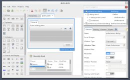
But now I am playing a little bit more and choose a somewhat unorthodox
layout for the UI I basically took out the inspector/property editor out
of the hierarchy and put it on a side so that it can take the whole
vertical space of the window (no more wasted space by the menu and tool
bar)
Loading Image...
I must say it looks odd at the beginning but after a few minutes it gets
better :)
What do you guys think?
Is it something worth considering?
What about adding it at least as an optional layout?
anyways, its late so I should probably get some sleep!
greets
Juan Pablo
_______________________________________________
Glade-devel maillist - Glade-***@lists.ximian.com
http://lists.ximian.com/mailman/listinfo/glade-devel